
10 pages
being divisible by 4 and allowing for a cover, inside front cover introduction
and then inside back-cover/back cover ad pages.
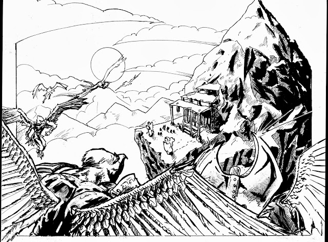
Panel 1,
really I need to get back in there and use a whit line to help the characters
pop from the background,
Panel 2,
well
at distance it looks good but closer up you can see it was really free hand
perspective and some of the pillar bases look terrible. Notice the little moo
chap being helped up? Think the added shadow helped show they were heading
outside into light.
Panel 3.
Really quiet
happy with this, I think the perspective on the building helped also for me
there's a shadow I put under the roof of the temple and it really
alone helped the building look like its being struck by the rising sun. you may
notice that this panel and the last panel meant we really didn’t get a good
look at talon, until you read the full comic!
Spent a bit
of time inking this page, especially the mountain.
Panel4
This panel
worked quit well, used simple motion lines for the snow and feathers the idea being
there’s wind built up from the flapping wings of our landing allies!


No comments:
Post a Comment