Page 7
Not the best
page in the world, or the most original.
Looking back the entire first section really I
took from what I could remember of a sequence in the witchblade manga books. It’s
not really a bad thing and not just plagiarising someone else’s work as it was
done by memory, still close enough to the original! I know in some ways all the
panels on every page are going to be subconscious or conscious rehashing of other
people’s ideas and what I’ve stored in my visual memory in one way or another,
but it does take away from the pride you
can feel when you know that it’s all your own.
That said, the perspective
or lack of in the first panel really takes away from the page too I think, the
hinges should be disappearing into the doorway more and create more depth.
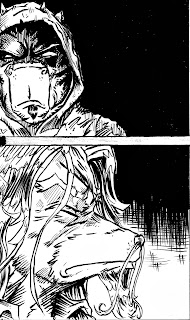
Panel 2, I masked
off the eye and used a splatter effect. From now on thou I will scan and use a
zip tone filter, but still this was experimenting a lot as with my first comic
and was really pleased with this.
I remember I was
going for the solemn look of the cover of the nirvana graphic novel. Looking back
now though I can see his shoulders should be more slouched and head tilted
forward more, also Sabre thigh would be more visible.
Panels 5
 In my fantasy
world where “humans don’t exist and animals have evolved to build great cities’’,
I decided that certain animals have evolved to avoid the problems they have now.
So cows that can be pushed over and then stay stuck have reduced their centre
of gravity so are now only 3ft tall! When I originally came up with this idea I
was going to have them ‘pop’ like space hoppers bouncing across the place! I
then decided that as these were to my yoda esque religious group (I’ll talk
more about their religion and the church of moo on the next post for page 8),
they may need to walk instead. Help make them more brooding! So here in panel 5
was supposed to be the moo father, lurking in the shadows of the temple. Really
think I was too worried of using more solid blacks here.


No comments:
Post a Comment