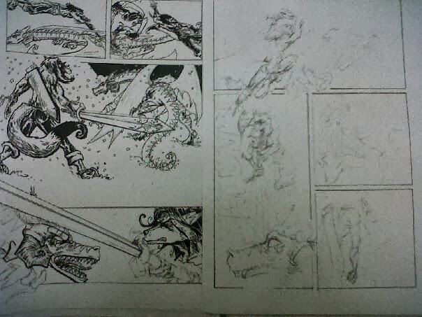
Originally the first 2 panels were sketched out on thumbs as a view from above but I struggled getting the appearance of grabbing his sword and landing back then so played some Mario bros and thought why not just side on.
Still perhaps the worst panels in the book so far. But then that’s
the joy of doing this for myself, its only practice, nothing serious, and every
time I make a mistake like this I learn from it. As soon as I stop learning and
improving, that’s when I’ll give up!
The 3rd panel left enough dead space for the title text and
credits before Panels 4-5 and my manga style show down!
.tif)


No comments:
Post a Comment